
Data Visualizer & ManagerTransform Your Field Data Into Actionable Insights
Transform Your Data Into Visual Intelligence
Transform pure text documents or pictures into dynamic heat maps and timelines. Take a picture, upload a spreadsheet, or use your field notes—our AI instantly converts raw data into actionable visualizations. No complex setup, no data wrangling. Just powerful insights from any source, anywhere.
Time Variant
Create dynamic graphs of your data points over time for any number of variables. Track trends and changes across seasons.
Space Variant
Generate dynamic heat maps and visualize data in relation to geographic locations. Cluster data into 1-8 zones for detailed analysis.
Time-Space Variant
Combine temporal and spatial analysis to see how your field data changes across both time and location simultaneously.
Heat Maps & Zone Clustering
Create dynamic heat maps to visualize data in relation to geographic locations. Cluster your field into 1-8 zones for targeted analysis and variable rate applications.
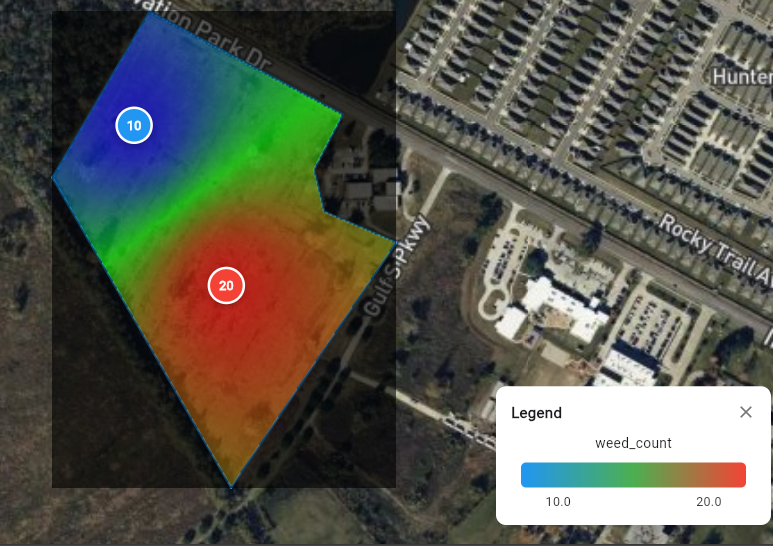
Heat Map Visualization
- →Visualize any variable as a color-coded heat map
- →Overlay multiple data layers simultaneously
- →Identify high and low concentration areas
- →Customize color scales and thresholds
Zone Clustering (1-8 Zones)
- →Automatically cluster fields into management zones
- →Analyze zone-specific statistics and trends
- →Create custom zones based on multiple variables
- →Export zones for precision agriculture equipment
Variable Rate Fertilization Applications
When visualizing nutrient maps, create Variable Rate Fertilization (VRF) applications for any number of nutrients and zones. Optimize fertilizer use and reduce costs while maximizing yield potential.
Track Changes Over Time
Visualize how your field data evolves across seasons, months, or custom time periods. Create dynamic graphs for any number of variables simultaneously.
Dynamic Graphing
- ▸Plot multiple variables on the same graph
- ▸Compare data across different time periods
- ▸Identify seasonal trends and patterns
- ▸Export graphs for reports and presentations
Data Sources
- ▸Field notes with timestamps
- ▸Excel sheets with time information
- ▸Weather data and historical records
- ▸Custom data uploads with temporal tags
Flexible Data Sources
Visualize data from multiple sources—field notes, Excel sheets, uploaded documents, or create blank visualizations for any field even without existing spatial or temporal data.
Field Notes & Documents
Import field notes with coordinate or time information and automatically generate visualizations.
Excel & CSV Files
Upload spreadsheets with geospatial or temporal columns and transform them into interactive visualizations.
Blank Visualizations
Create empty visualizations for any field and manually add data points as you collect information.
Automated Data Sync
Connect with external data sources and keep visualizations automatically updated with the latest information.
Satellite Data Overlays
Enhance your field visualizations with comprehensive satellite data overlays. View elevation, vegetation health, soil composition, and weather patterns—all in one place.
Elevation Data
USGS elevation maps showing max/min elevation and topographical features.
NDVI (Vegetation Index)
Monitor crop health and vegetation vigor with normalized difference vegetation index data.
Soil Composition
AI-predicted soil types and composition based on geospatial analysis.
Nitrogen Levels
Track nitrogen availability and distribution across your fields.
Bulk Density
Analyze soil compaction and density variations throughout your fields.
Weather Data
Historical and forecast weather overlays including precipitation, temperature, and wind.
Real-World Application: Precision Nutrient Management
A farmer uploads soil test results with GPS coordinates. FarmMind's data visualizer creates a heat map showing nutrient deficiencies across the field, clusters it into 5 management zones, and generates a variable rate fertilization prescription—all in minutes.
The Challenge
Uniform fertilizer application wastes money in nutrient-rich areas and under-fertilizes deficient zones, reducing overall yield and profitability.
The FarmMind Solution
Upload soil data, visualize nutrient zones, generate VRF prescriptions, and reduce fertilizer costs by 20-30% while increasing yield in previously under-fertilized areas.
This feature is currently in Beta. Contact us for early access and exclusive insights.
Request Beta AccessReady to Visualize Your Field Data?
Transform raw data into actionable insights with FarmMind's powerful visualization tools.
Get Started Free